Blogger's new interface - Inability to revert to the old one
Almost one year back, I have started a thread here to discuss about the new blogger interface. Most of the participants in that discussion either disliked it or were more comfortable with the old interface. Earlier, users had the choice to revert to the old interface but now the option have been removed and one is forced to use the interface.
Have you been using the old interface or the new interface all these days when you could choose between the two?
How comfortable are you with the new interface and do you feel like going back to thje old interface?
What according to you are the positives and negatives of the new interface with respect to the old interface?
Well, I liked the old interface a lot more. It was simple. But that's just me. also maybe, I was so used to it.
Ranjith , I too like the old interface but I think the new interface when get used will be much helpful. It is like a books with indexes on sides for easy navigation of almost blogger and google+ including views, adsense and blogger updates.The intergration between them is very smooth .
One layback is that, this new interface won't be on the comfortable level for people who don't belong to tech backgrounds .The old one was great for any beginneers .
All this is going over my head.
same I don't understand the point intended clearly
TF, TNO: Do you mean to say that you are not understanding the topic of the discussion here?
I still like teh old interface even after a year. The new one appears to be more lighter than the old one but the older one was more aesethetically pleasing.
Here are three small things I did not like in the new interface or things that somehow appear to be wrongly done:
I really don't understand why Google wants to fix some long bars of information on the top of the page. They give less space for other important things. The space being utilised here may be same as that in the old interface but at the first, it appears to be bigger and my subconscious doesn't accept that it is infact the same. May be the shadow at the bottom of that space is doing the magic.

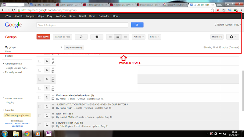
Things are of course better than Google groups where half of my screen space is wasted.

In the overview tab, when one moves the mouse pointer over the graph and brings it out and scrolls down, the bubble showing the visits count stays fixed and obstructs other elements. Surely a bug.

Stats > AudienceThe presentation appears cluttered

And, if you use blogger on a device with a small screen, then it's going to be a hard time. Elements on the page seem to be too much out of place.

The red coloured text in the 4th screenshot should read as Shouldn't the line be broken here?
